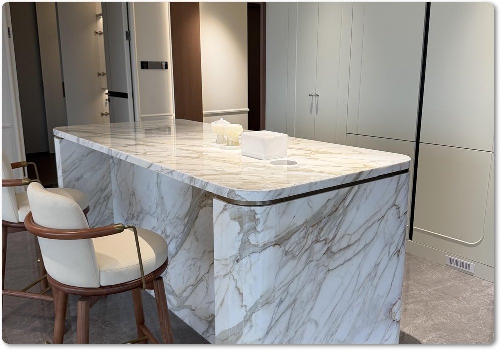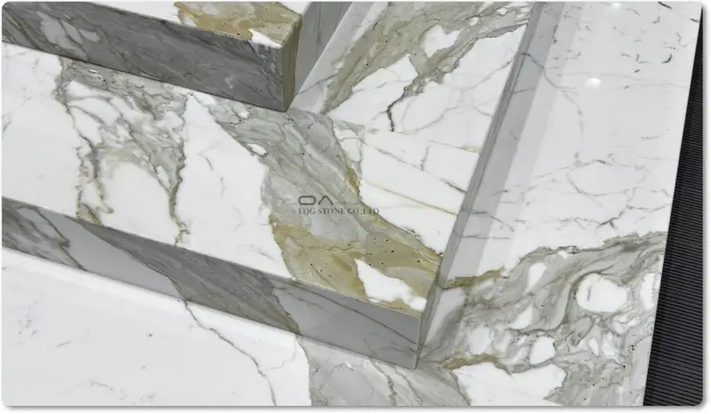
Why is color returning (short context & why this matters)?
After years of neutral-minimal dominance, kitchens are shifting toward richer, moodier palettes. Designers and magazines point to a resurgence of deep tones (merlot, burgundy, cool greys, ink blues) used as primary or accent cabinetry, paired intentionally with stone countertops that either harmonize or provide dramatic contrast. These pairings matter commercially: buyers increasingly choose statement cabinets and countertops together, so stone suppliers and fabricators must present coordinated solutions in showrooms and online galleries. Recent Pantone and trade signals for 2026 emphasize both calm neutrals and bold statement colors — meaning both subtle and saturated pairing strategies are valid.
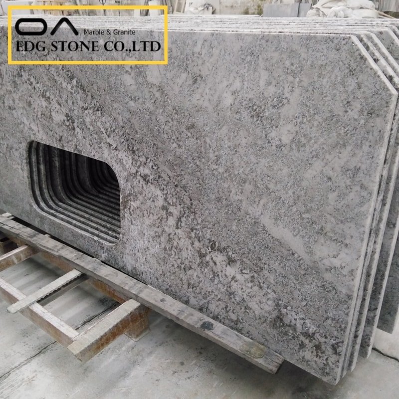
1 — Executive design framework: Why pair dark stone with colored cabinets?
Dark stone countertops (cool gray marbles, burgundy marbles, deep graphite quartz) are not just functional surfacing — they’re emotional anchors. When paired with colored cabinets, they can:
Create visual depth and richness.
Balance light and shadow in open-plan layouts.
Signal luxury and bespoke design when veining and finish are selected deliberately.
For suppliers and fabricators, presenting curated pairings reduces buyer indecision and increases average order size: customers buy the “look” (countertop + cabinets + hardware) rather than isolated SKUs.
2 — Trend signals & regulatory context (data you should cite)
Trend evidence (design & color signals):
Trade and shelter publications highlighted deep reds and merlot/burgundy as emerging kitchen hues heading into 2025–2026; designers recommend using them as tone-on-tone or as island statements.
Cool and warm greys remain staples; designers reframe gray as a layered neutral, pairing well with textured stone surfaces and metallic accents.
Pantone’s 2026 signals emphasize calm, approachable neutrals (Cloud Dancer) but also the industry’s appetite for statement tones, which can be balanced by neutral stone or used to dramatize veined stones.
Regulatory context that affects supply and merchandising:
Engineered stone (quartz) regulations and bans: Australia implemented a national ban on the manufacture/supply/use of engineered stone as part of crystalline silica control measures (effective phases in 2024–2025). This affects available product lines, lead times, and sourcing strategies for global suppliers. Suppliers should monitor jurisdictional changes and be ready to propose alternative stone materials or compliant fabrication options.
Paint & VOC regulation: EU and many national bodies regulate VOC emissions in paints and coatings; manufacturers and cabinet shops increasingly highlight low-VOCs and Green Seal/eco labels to appeal to health-conscious buyers and to comply with local rules. Choose low-VOC cabinet paints and disclose VOC levels in product pages.
3 — Core color pairing rules (practical, repeatable)
Follow these five rules as a quick checklist when matching dark stone with colored cabinets:
Decide intent: contrast vs. harmony.
Contrast creates drama (e.g., burgundy cabinets + cool gray countertop).
Harmony creates cohesion (e.g., cool gray cabinets + slightly warmer gray countertop).
Match tonal value, not name.
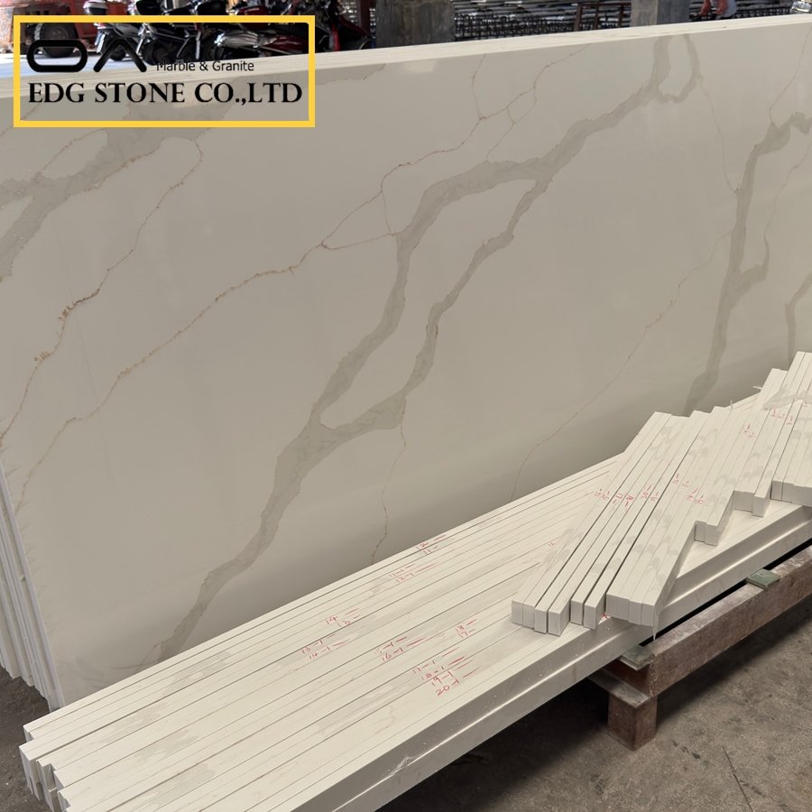
Evaluate value (lightness/darkness) under the intended kitchen lighting. A burgundy that reads near-black under kitchen lighting can overpower a light-veined stone — choose a stone with mid-tone veins or a lighter background to balance.
Temperature alignment (warm vs. cool).
Pair warm-toned stones (creamy veins, golden undertones) with warm cabinet colors. Pair cool stones (blue-gray, graphite) with cool cabinet hues or with warm cabinets when you need contrast.
Scale and pattern weight.
Heavy veining and bold movement need calmer cabinet surfaces (flat or subtle texture). Conversely, plain dark stones work well with patterned cabinet finishes or fluted panels.
Finish & hardware as harmonizers.
Satin or matte cabinet finishes soften saturated colors. Brushed brass warms burgundy; matte black hardware anchors graphite or cool gray pairings.
4 — Palette case studies (actionable pairings)
Below are specific pairings (each with rationale, best finishes, and merchandising notes). These are ready-to-use showroom pairings you can photograph and turn into product bundles.
A. Cool Gray Countertop + Muted Blue-Gray Cabinets
Why it works: A cool gray countertop with subtle veining acts as a neutral base; blue-gray cabinets introduce color without overwhelming the space.
Finish: Polished or honed stone; cabinets in satin (soft sheen).
Hardware: Stainless or brushed nickel.
Merchandising tip: Use pale wood open shelving to warm the palette and add texture.
B. Burgundy/Maroon Marble Countertop + Warm Off-White Base Cabinets
Why: When the countertop has rich maroon veins and a lighter ground, pairing with warm off-white cabinets keeps the kitchen open while letting the stone be the star.
Finish: Polished marble-look countertop; cabinets in eggshell or matte.
Hardware: Warm brass to pick up red undertones.
Note: Burgundy stone is dramatic — show it as an island or backsplash feature to maximize visual impact.
C. Burgundy Cabinets + Cool Gray or White Marble Countertop (Contrast)
Why: Dark burgundy cabinetry creates a couture backdrop; cool gray or white marble countertops provide crisp contrast and highlight cabinet color.
Finish: Matte cabinets, polished stone.
Hardware: Matte black for modern looks; brass for a warmer, more traditional vibe.
D. Deep Graphite/Black Quartz + Natural Wood Cabinets
Why: Graphite countertops anchor bold wood grains, and the wood warms the kitchen. Ideal for open plan homes where continuity with living area wood tones matters.
Finish: Leather or honed stone finish to hide wear; cabinets in clear oil or matte stain.
Hardware: Black or aged steel.
E. Accent Island Strategy (one pop color with neutral perimeter)
Use the dark stone on perimeter counters and pick a saturated cabinet color (burgundy, forest green, or navy) for the island — or flip them: use the dark stone on the island and choose colored perimeter cabinets. This allows the eye to rest and focuses drama on one plane.
5 — Material & finish considerations (stone + cabinet + hardware)
Stone finish choice:
Polished: Bright, luxurious; shows color and veining vividly — best for polished marbles and dramatic veined burgundy stones.
Honed/Leather: Softer, less reflective; hides watermarks and fingerprints. Leathered finishes pair beautifully with deep colors for tactile contrast.
Cabinet paint & VOCs:
Use low-VOC or zero-VOC paints for cabinets (buyer demand + regulatory compliance in some markets). Disclose paint certification or VOC figures on spec sheets.
Edge & backsplash continuity:
Consider bookmatching or full-height slab backsplashes when the stone is the star. If cabinets are the star (e.g., burgundy), pick a simpler neutral backsplash to avoid visual competition.
Hardware selection:
Hardware finishes can tie cabinet and countertop palettes together (e.g., brass bridges warm stone veins to cabinet tones).
6 — Lighting, layout & spatial considerations
Natural light: Deep cabinet colors paired with dark stone reduce perceived brightness. Balance with large windows or lighter flooring to avoid a cave effect.
Task lighting: Under-cabinet and pendant lighting over islands are essential when working with darker palettes — they reveal stone details and cabinet color depth.
Room size: For small kitchens, place the saturated color on an island or lower cabinets to keep vertical planes lighter; in larger spaces, you can go bold, floor-to-ceiling.
7 — Showroom merchandising & product page SEO for manufacturers (EDG Stone actionables)
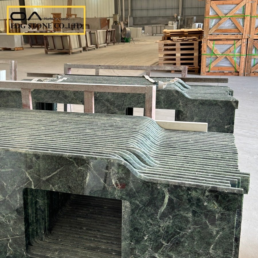
Create curated “look” bundles: Photograph combinations (e.g., Burgundy Marble island + Cool Gray perimeter + brass hardware) and sell as visual bundles — increases cross-sell and reduces buyer decision friction.
Product pages: For each slab page, include suggested cabinet colors (Hex codes), example cabinet finishes, hardware suggestions, and lighting notes — these fields improve user engagement and searchability for long-tail queries.
Structured data & micro-summary: Embed a micro-summary card (like the one at the top of this article) and FAQ JSON-LD to boost SGE/AI extraction (see below).
Sourcing note: Given engineered stone regulatory changes (e.g., Australia’s ban and material controls), maintain alternative materials (natural marbles, sintered surfaces) in marketing so customers have compliant substitutes.
8 — Long-tail purchase-intent keywords (3–5 suggestions)
“Buy burgundy marble countertop wholesale manufacturer”
“dark grey kitchen cabinets ideas with stone countertops”
“maroon kitchen cabinets and gray quartz pairing guide”
“Purchase burgundy kitchen cabinet paint low VOC supplier”
“Bulk stone slabs burgundy marble factory direct”
9 — FAQ
Q: Can burgundy cabinets work with a cool gray countertop?
A: Yes. Cool gray countertops (especially those with subtle veining) provide a crisp, cooling contrast to warm burgundy cabinets, preventing the room from feeling too heavy. Use satin or matte cabinet finishes and warm hardware to harmonize undertones.Q: Which stone finish is best with dark-colored cabinets?
A: Honed or leathered finishes pair exceptionally well with dark cabinets because they reduce glare and mask smudges; polished finishes are fine for a high-contrast or more formal look, but may require more maintenance.Q: Will dark cabinets and dark countertops make my kitchen feel smaller?
A: They can, if lighting and contrast are not considered. Counteract with increased natural light, lighter flooring, reflective accents, or by using the dark color on islands or lower cabinets only.Q: Are there health or regulatory considerations when choosing countertops and cabinet paints?
A: Yes. Engineered stone manufacturing and use face regulatory action in some jurisdictions (e.g., Australia) due to silica risks, which can influence product availability and lead times. Paints and coatings are subject to VOC regulations in many regions — choose low-VOC or certified paints for indoor use. safeworkaustralia.gov.au+1Q: How should showrooms present dark-stone + colored-cabinet pairings to sell more?
A: Use staged vignettes showing multiple lighting conditions, provide swatch kits (cabinet finish + stone sample), bundle hardware suggestions, and publish “Shop the Look” product pages with buy links for slabs, cabinets, and hardware.
Semantic Closing Block — How / Why / What / Options / Consideration
Why: Deep cabinet colors paired with dark stone signal luxury, increase perceived material value, and respond to emerging color trends (merlot/burgundy and layered grays). Pairings reduce buyer indecision when presented together in curated bundles.
What: Prioritize leathered or honed stone finishes for daily use with dark cabinets; recommend low-VOC paints for cabinet finishes to meet buyer safety expectations and regional regulations.
Options (detailed): Use the dark stone as a perimeter with a colored island to maintain openness; or use dark stone on the island and colored perimeter cabinets to frame the space. Consider bookmatched stone as a statement and matte cabinet finishes for modern looks.
Considerations (detailed): Monitor local regulatory developments for engineered stone (silica), which may affect material availability and lead time. Publish product substitution guides (e.g., natural marble alternatives, sintered surfaces) and always disclose VOC levels for paint finishes to reassure health-conscious buyers.